art, Behind the brush, Book Updates!, illustration, It's sharing time!, Recommended Reads, Virtue Heroes

Reframing Heroism: Not What You Might Think

“Go big or go home” is an attitude a lot of us grew up with. As a cradle Catholic, I’m sure I knew, deep-down, that Jesus’ teachings didn’t exactly support that message. But the glamor of shiny, bullet-deflecting bracelets and invisible jets tended to tweak my childhood interest a tad more than things like washing my friends’ feet or going last. Such is the concrete mind of a young child. (Although, “concrete” becomes a bit blurred when we get into discussions about talking cars and backpacks. But the psychology of child development is beyond the scope of this post.)

As a Catholic mom, how do I instill in my concrete-thinking, talking-backpack-loving children, a love of quiet heroism? Or, to use a term more specific to the vocabulary of our Christian faith, a love of virtue? Is there a book or something?

Actually, there are 35 in the works.

Cathy Gilmore, aka “Mrs. Virtue Lady,” is masterminding a massive project, and I am honored to be a part of her amazing vision. Her forthcoming children’s picture book series Tiny Virtue Heroes™️ gives parents, grandparents, catechists, and teachers of preschool-aged children the perfect tool to begin fostering a love of all things virtuous.

“Mrs. Virtue Lady” Cathy Gilmore is the mastermind behind the Virtue Heroes universe.

Written to reframe our notions of superheroes, each story unfolds through the eyes of a cute, relatable-to-children animal character who happens to witness a major moment in Christian history. My mom mind is shouting, This is brilliant! Kids love animals! Ranging from mice to tilapia, this wild menagerie of critters was created with kids’ glorious imaginations in mind. Each lovable character plays the role of a sidekick to important folks like Mary and Jesus, heroes that we really want to capture our kids’ attentions. Besides assigning each story a little animal hero, each hero is in turn the icon of a specific virtue. That special virtue power is his or her super power.

A Mouse and a Miracle is the first book in Cathy’s Tiny Virtue Heroes™ series.

Book One in Gilmore’s Tiny Virtue Heroes™️ series

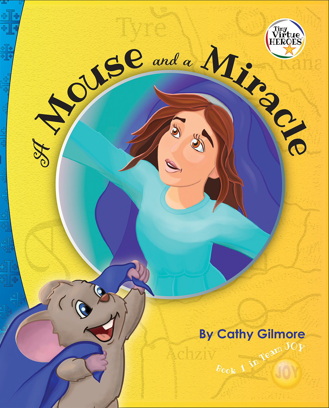
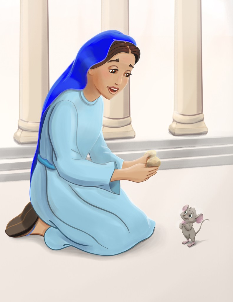
Moshe (“Mo-SHAY”) or “Mo” the Mouse is the first tiny virtue hero we meet. He is the narrator of A Mouse and a Miracle. In this virtue story of humility, Mo invites readers to delight in the humble joy of his hero Mary, from his unique perspective witnessing the Annunciation.

“I want kids to feel Mary’s joy, not just learn about it,” says Gilmore, already an award-winning children’s book author and ministry founder of Virtue Works Media. “Mary’s humility, her smallness, is represented by a tiny mouse. I want children to picture Mo and associate his story with the virtue of humility.” Ultimately, children will “collect” and learn about 35 virtues by associating each one of them with its corresponding animal icon and a story about a biblical character or a saint. Besides amassing an impressive library of virtue stories, kids will be able to enjoy the brand’s virtue-building toys, games, and even pillow cases that double as superhero capes to build their own virtue heroes universe. Move over, Marvel!

I am completely enamored with Cathy’s VERY big plans, and I pray the Holy Spirit continues to guide my (digital) pencil as I endeavor to decorate her virtuous text with my humble illustrations. Having experienced the charge to tastefully represent the saints, I was not completely surprised by the God-fear/awe/I’m-not-worthy feeling that froze my fingers upon my first attempt at sketching the mother of God. But creating art is a holy experience for me. I am drawn into a deeper relationship with Mary. Even as I pray my Rosary, I now picture the Annunciation in our virtue heroes palette of colors!

Mary feeding bread to Moshe

Gilmore’s tagline “Virtue is REAL super power!” is the theme of A Mouse and a Miracle and all the Tiny Virtue Heroes™️ books. “The holiness of heroic virtue now exists in a modern, imaginative context,” says the St. Louis based ministry founder. To learn more about Cathy Gilmore and her Tiny Virtue Heroes™️ check out her IG feed, Twitter, and Facebook.

A Mouse and a Miracle (Perpetual Light Publishing) makes its heroic appearance at bookstores, both virtual and live, in July 2020.

art, Behind the brush, Book Updates!, illustration, Uncategorized

A Picture’s Worth: Behind the Brush

Delightful Children's Book! For ages birth to 7.
Sweet, sweet bedtime story for kids ages 3-8


Although you may have seen the official release of debut children’s book author Erin Broestl back in 2019, I’m adding it to the list of wonderful things happening in 2020.

There are so many aspects of this highly-acclaimed Christian children’s picture book (CPB) that I could blog about it for a month of Sundays.  Eventually, I’ll secure an interview with the gifted wordsmith whose — should I call it poetic prose?– seems to speak a language all its own. The making of God Made the Moonlight is the perfect topic for a “Behind the Brush” post. That is, it’s a great example of how illustrations can shape a story. Therefore, I’d like to share a look back at the illustration journey that brought out a second, rather unexpected, meaning to Mrs. Broestl’s God Made the Moonlight.

I can’t believe it’s been three years, but it has. While this is not completely unusual as far as the typical amount of time it takes to bring a new CPB to life, it’s a bit longer than I’m used to. As usually happens in the illustration business, I received the author’s manuscript, nicely-typed, with “illustration notes” next to each block of text. Many, I’d even venture to say most, new authors of children’s books include such notes with their submissions, in varying degrees of details, along side their stories.  Erin’s little notes were blessedly few, but she did have some idea of certain colors and other elements she envisioned for her first book. She suggested a sort of genre (fantasy, in this case, “I’m seeing castles, a fairy-tale,”) and even lent me a book with images that she liked.

For almost two years I sketched out scenes of hazy moons and foggy, night-time castle scenes. While there was nothing technically wrong with the watercolor sketches, I suppose, the “meh” feeling I got from them kept me up at night. Since the Broestls had just welcomed a new member to their family, I chanced that Erin might also be awake.


ink-and-wash painting for proposed manuscript
Early idea for “God Made the Moon”


“Erin, would it be ok with you if I rearranged the order of some of your lines?”  I texted.

I proposed the idea of using the phases of the moon to guide the sequence of the picture-story that was just beginning to come to life inside my head. (To understand this sequence of events, I highly recommend re-reading your copy of GMtM right now and trying to imagine the text alone on a single sheet of paper.) The verbiage was already there in Broestl’s quiet, charmingly unassuming manuscript:

  • Each day, the moon’s shape changes a little.
  • Tonight, it looks like the Cheshire Cat’s smile.
  • Soon, it will be so dark that I can hardly see it.  A new moon!

There were references to car rides, and airplanes, and city lights. And then,

I love the moon! Just knowing that it is there makes me feel at home, no matter where I am.

There it was: the longing, the pull, the emotion, the universal themes of journeying, going out into the unknown with a spirit of adventure, yet yearning for the familiarity of home.

The story.

I could see the girl on the page, packing her suitcase, the child being read to asking, “Where is she going?” There is a boy on the next spread: her little brother. They are out of their norm, experiencing things that are all new. They are happy, but sometimes the unfamiliarity of a situation can be a little scary.

Packing her suitcase
A young girl sets out on a journey from the city to the country.


How blessed I am to work with such a gifted writer as my friend, Erin Broestl! And I’m so thankful that she was open to listening to my new “vision” of GMtM. I sketched out, verbally and on paper, my ideas for a “subplot” to the revised manuscript. The images came to me more easily now, and I worked with a clearer goal in mind. Erin and I collaborated, filled with a new energy.  Over the next months I painted, adjusted, and sometimes even deleted new spreads of artworks. (Here’s a deleted scene from the storyboard before we had the full new story worked out:)

Screen Shot 2020-01-13 at 12.28.19 PM


This one’s Erin’s favorite (it made the cut):

scene from God Made the Moonlight by Erin Broestl and Jean Schoonover-Egolf
The moon plays peek-a-boo through the treetops.


“It’s like you saw inside my mind,” says Broestl, who recalls a family trip from her childhood. Believe me, it is a rare thing when an illustrator can actually see what the author “has in mind” for the proposed manuscript. And I assured Erin that this was just a coincidence! I’ve since said this, so many times, to so many children’s book authors:

“An illustrator’s happiest clients are the ones who, when it comes to the artwork,  completely hand over the reins to the artist.” 

The simple truth is that, no, the illustrator cannot see inside the author’s mind. The more details the author has already conjured up in his or her mind about the way each page “should” look, the more that author is setting himself/herself up for disappointment with almost any illustrator’s work. Please see my post on “How to prepare a children’s book manuscript for your illustrator.”

Mrs. Erin Broestl is one amazing woman, folks. She blogs at Eight Hobbits. Although God Made the Moonlight is Broestl’s first published children’s book, she’s no stranger to the writing industry. I’ve no doubt we can expect more great volumes from Erin.


art, Behind the brush, illustration, Uncategorized

Behind the Brush: An Illustrator’s Advice on HOW to Prepare Your Children’s Book Manuscript for Your Illustrator

Many prospective children’s book authors are already familiar with the concept of storyboarding, but I’ve come to realize that it is important to help wordsmiths understand the purpose of pictures in a book.

Despite what Wiktionary might say, illustrations that merely echo the author’s words do not belong in Children’s Picture Books (CPBs). A good illustrator doesn’t repeat, in pictures, what the author has already stated in the text. Envision, if you will, a page with an apple and the word “apple” typed underneath. While this type of literal illustration has its place in school readers, such obvious image-feeding only serves to bore the audience seeking a story for entertainment. Chip Kidd said it best in this 2012 Ted Talk (for adults only!) about designing the cover for Stephen King’s Jurassic Park, “Because this (putting the word “apple” under the picture of the apple) is treating your audience like a moron. And they deserve better.”

Illustrators are trained to create in a way that is quite different from how an author writes. Rather, our job is to compliment and expand your text, similar to the way a composer adds a harmony part to the melody. What a dull piece it would be if every member of the choir sang the exact same notes! Our ears, and our eyes, delight more in intertwining phrases and media that seem to dance like two partners who’ve known each other for 50 years but still find something new about one another every dance.

In children’s books, it is important to avoid “spoon-feeding” the story to the reader/listener. Using more open-ended sentences and “breathing room,” in the story is essential to writing great children’s literature. Leaving space for the child’s imagination to work invites the child to become an active participant in the story. To some extent, you can let your reader fill in his/her own details in your story. Give children something to think about and wonder over. When the child is actively trying to guess what’s going to happen or how exactly something did happen, he/she becomes invested in the story’s outcome and wants to see it (or hear it) through to the end.

An author’s words should tell the reader only so much. Even most adults who cozy up with a good book don’t appreciate an overly “voicey,” commanding, or condescending commentary. I don’t want to be told what to feel! Make me feel it! Likewise, there’s a better way to express, “Sally felt sad because her favorite toy was broken.” Let the illustrator (and designer) express that sadness, not only in Sally’s face, but also in the page spread’s sudden hue change to a cool palette, a lower position of the words relative to the image, a thinner, more deflated-looking font, and so on. Perhaps you don’t even need to reiterate that it was her favorite toy because the illustrator has done such a great job, on previous pages, of showing how important that toy was to Sally.

Some of the suggestions in this post fall outside of the typical illustrator’s scope of advice-giving. I’m coming at you from the point of view of someone who’s had the pleasure of working as an author, an illustrator, a graphic designer, an art director, and, most recently, a publisher. From this more global perspective, I’ve collected (and paraphrased) the following pieces of useful advice to authors writing children’s books:

Bark less, wag more.

You have only 500-1000 words to use. Make them count. (More than 1500 words and you are moving into another genre such as early reader.) Skip the colorful descriptions, strings of adverbs, and long-winded character development. Focus on a strong, well-timed rising plot with a single, clear-cut resolution. A well-executed drawing of a woman peeling a large, bright, juicy orange in a sunny kitchen has no need for the words “the woman was peeling a large, bright, juicy orange in the sunny kitchen.” Now you have more space to write, “Mom said the children must hurry, so she helped with breakfast.”

Show, don’t tell.

As you write, ask yourself, “What ideas could be expressed in pictures rather than in words?” Leave plenty of breathing room, that is, ample creative space, for the illustrator to add visual layers to your story. In the third book of my Molly McBride series, never once did I mention in words that Dominic’s mom found the missing invitation: that entire twist of events was left to the illustrations!

The missing invitation is discovered!
Molly and Dominic are BUSTED! Moms rock.

But the Amazon reviews clearly told me that I correctly conveyed, via illustrations alone, this crucial plot point. My readers were able to surmise how it came to light that Molly and Dominic had misbehaved.

Chapel scene from Book # of the Molly McBride series
Mass before Ora et Labora


Organize from the get-go.

I advise authors submitting CPB manuscripts to number a sheet of paper from three to 30. The first page, page 3, will be single, right-sided (recto) page. The rest will be in spreads with the lesser-value even number on the left (verso) and the odd number on the right. (E. g. the first spread will be pages 4-5.) Place small chunks of your text beside the page and spreads on this list. Even better, check out this free tool on the Perpetual Light Publishing website.


Keep the pages turning.

End each odd page on a mini “cliff-hanger.” For example, instead of page 5 reading something like, “Joey saw the weirdest-looking ball he’d ever seen hovering in the air,” put “He stopped in his tracks. Hovering in the air in front of him was the weirdest thing Joey had ever seen.” Don’t reveal that it was a ball until spread 6-7. Better yet, don’t use the word “ball” at all. Let the illustrator paint it!


Plot a traditional plot.

Known in some circles as “the traditional plot,” there is a practically no-fail secret to making anything entertaining. And yes, it takes plotting. It goes like this: introduce the character, introduce the conflict, build up the action (most of the book), climax, resolve.  This works just as well for an Indiana Jones movie as for a Backyardigans episode. Knowing that you have to get all this in between pages 3 and 30, you can even look at the list of page numbers from “Organize” above, and do some tightening up to ensure you are giving these essential parts of the story the proper order and length. There are plenty of articles online about this.

PLOTplot-01

Good things come in threes.

From pigs to bears, the golden rule of children’s picture books (and many other forms of entertainment) is that Rule of Threes. In a nutshell, this generally means it takes your main character three attempts to resolve the conflict. This is a proven, old-as-the-hills storytelling strategy can be used in other elements of the story as well, such as three supporting characters or a setting of three rooms. Look for additional design elements in sets of three, like text boxes and background details.

In summary, a book’s illustrations have the power to not only bring out the best in the author’s words, but also to beckon the reader’s imagination to become an active participant in the story. And that’s what we all want, isn’t it? We want our books to be creative works that beg to be enjoyed again and again, for generations to come.

Dr. Jean Schoonover-Egolf, creator of the award-winning Molly McBride series of Catholic children's books.

Jean Schoonover-Egolf is a retired Internal Medicine physician-turned-homeschooling-mom/author/illustrator/publisher. A catechist and volunteer librarian at St. Patrick Parish in downtown Columbus, Ohio (Go, Bucks!), Dr. Egolf spends her free time gardening and rearranging the dishwasher.